
I’ve had fun over the last few days chatting with colleagues, friends, and family about the March-related weather in Charleston. See my previous blog posts to find out the background of this information. Here I’ll outline two new developments that came up today. Again, all of this pertains only to the month of March and only in Charleston SC.
(1) When do we ever use calculus, anyway?
In an e-mail yesterday, Dan Jarratt remarked that he was surprised by the result that the today-to-tomorrow temperature change had an average (mean) of +0.037 degrees Fahrenheit. In other words, given today’s high temperature, on average we expect it’ll be about 0.04 degrees warmer tomorrow. This isn’t a very big difference, as Dan remarked; it was lower than he thought it would be. This made me wonder if I too thought this was a small temperature change.
I would guess that the hottest month in Charleston is August. (That is, August is the month that has the highest average temperature.) Also, I would guess that the coldest month is six months from August, so that would mean February. Assuming that the temperature shifts in a sinusoidal fashion, we’d get a nice sine function with a period of 12 months; a local maximum in August; and a local minimum in February. This led to the following question, which I asked my Calculus students today:
When is the temperature in Charleston increasing most rapidly?
First, we had some discussion on how we could rephrase this question into one about calculus. If the temperature is increasing most rapidly, that would mean that the slope of the tangent line is its largest; this would occur halfway between February and August. We agreed that this would be the month of May. Let T(x) be the temperature at time x. Graphically, if the temperature is increasing the most rapidly, then this is where T'(x) has a local maximum, so T”(x) changes sign from positive to negative. In calculus, we call this a point of inflection: a place on the graph where the tangent line increases most rapidly (should such a place exist). Alternatively, it is where the graph changes concavity — in this case, from being concave up to concave down.
(2) What would a numerical simulation tell us?
Both my College of Charleston colleague Jason Howell and Dartmouth professor François G. Dorais suggested my predictive model wasn’t great, and
@katemath Maybe a random walk model would be better?
— François G. Dorais (@fgdorais) March 28, 2013
Thankfully, Jason was willing to help write some code toward this goal. (His code is given below, written for MATLAB, in case you’re interested!) He gathered historical averages for high temperatures for each date in Charleston, restricted to the month of March, from weather.com. The averages were computed using data from 1893 through 2013. Given that the average temperature change was +0.037F and the standard deviation of this temperature change was 8.39, we can run a number of trials to answer the question
How many days in March can we expect to be at or below their historical average temperature?
Jason’s code simulated one million different March months, given a starting temperature on March 1st of 68 degrees F. Here’s a histogram of results:
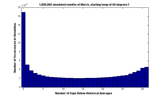 Of course, March 2013 hasn’t finished quite yet. But this histogram does tell us that if we end up with 23 or 24 days with an “at or below average” temperature, this isn’t exceedingly rare — or it isn’t as uncommon as I had thought it would be.
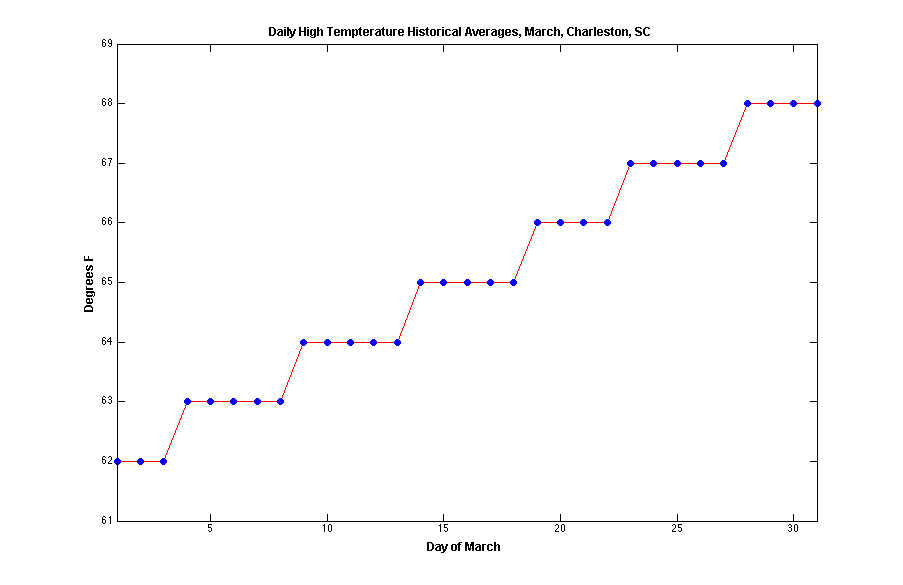
Here’s a graph of the daily average temperatures (based on the same historical data):
Jason’s Code:
function y=weatherexp(start_temp, num_trials)
%set historical averages, from weather.com
hist_avgs = [62 62 62 63 63 63 63 63 64 64 64 64 64 …
65 65 65 65 65 66 66 66 66 67 67 67 67 67 68 …
68 68 68];
%initialization
num_days=length(hist_avgs);
temp_diff = zeros(size(hist_avgs));
num_days_below = zeros(1,num_trials);
%parameters for normally distributed daily temperature changes
%from months of March from 1893 to 2012
stdev = 8.39;
avg = 0.037;
%loop over trials
for j=1:num_trials
%set temperature for start of a simulated month/week/etc.
curr_temp = start_temp;
for i=1:num_days
%get temperature change
temp_change = avg+stdev*randn(1,1);
%new temp
curr_temp = curr_temp + temp_change;
%how far from average?
temp_diff(i) = curr_temp – hist_avgs(i);
end
%count number of days below average
num_days_below(j)=sum(temp_diff<0);
%temp_diff
end
%histogram of the num_days_below data
figure
hist(num_days_below,[0:31])
y = num_days_below;