MOTION CHARTS
Google, Google Apps, instructional technology, Research

Using a Motion Chart to Visualize Data

While motion charts are not new, I just learned about them and I thought they would be something that faculty can use in their classes to help students see and understand certain concepts in their classes.
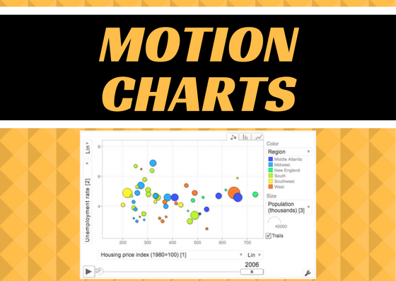
Motion Chart

A motion chart, at least as it’s used in this post, is a bubble chart that can be controlled by the viewer, not the creator.  It allows the viewer to visualize multiple dimensions of the data.   These dimensions are shown by the bubble size, color and position on the chart over time.  Here is an example from Kwantu.com:Screenshot of the bubble chart

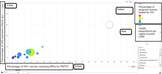
  • Vertical (Y) axis – Percentage of HIV exposed infants given ART for PMTCT at birth
  • Horizontal (X) axis – Percentage of HIV+ women receiving ARVs for PMTCT
  • Bubble size – Health expenditure per capita (current US$)
  • Bubble colour – Pregnant women receiving prenatal care (%)
  • Time – Years

According to JuiceAnalytics, “modern-day motion charts were developed by an organization called GapMinder as part of a product called Trendalyzer.  Hans Rosling, one of the founders of GapMinder, popularized the motion chart visualization in a much-admired TED Talk.”

What are they good for?

What I think sets this chart type apart from other charts in either Excel or Google Sheets, is that they are interactive.  The end-user can use the sliders to change time and the dropdown menus to change the data parameters shown.  It allows the viewer the control over what they see to help them better understand the data and to work with it in multiple ways.  Any discipline that uses statistical or relational data over time can benefit from a motion chart (political science, sociology, history, education, biology, etc.).

How do you make one?

With Google Sheets, part of CofC’s Google Apps for Education (G-Suite), you can make a motion chart in just a few easy steps.

  1. Create the data in Google Sheets, or upload it from an existing Excel spreadsheet into Google Drive.
    1.  Column A (first column) should contain the data you want to track.  In the example above, it is Country.
    2.  Column B should contain the time data and should be sorted/grouped by time.
    3.  Column B also needs to be formatted as a date, not text.
  2. Highlight all the data in the table and click on Insert > Chart.
  3. Choose the Chart Types tab.
  4. Scroll to the bottom under Other and choose Motion Chart.
  5. Click Insert.
  6. Once it’s inserted you will be able to change the X/Y access, use the scroll bar to slide through the times and the boxes on the right to narrow the data seen.

BONUS — You’ll also notice, in the upper right corner, that you can choose between a bubble chart, bar chart, or a line chart.

Let us know

If you try this let us know how you are using it in your teaching or with your students!  We love to hear from faculty.

6 REASONS TO USE GOOGLE SHEETS
Collaboration, Google, Google Apps, instructional technology, Share

6 Reasons You Should Be Using Google Sheets Instead Of Excel

I have always said that if I could only have two applications on my computer it would be Photoshop and Microsoft Excel. With those two applications I can do almost everything I need to do in a day. Lately, however, my eye has drawn to Google Sheets, and I have to say, I love it.

Now some of you may be saying, “Why do I care? I don’t teach accounting.” Well you don’t have to teach accounting to use spreadsheets in your teaching. They are great for collecting text-based information, running statistics and doing calculations, and graphing and analyzing text or data. So now that you are ready to use spreadsheets in your classroom, here are 6 reasons why you should use Google Sheets instead of Excel.

Reason 1: Collaboration

Unlike Excel, Google Sheets is collaborative. All CofC students already have Google accounts so it’s very easy to share a spreadsheet with them or for them to share with one another. When collaboratively editing a sheet each student can see the exact cell that is currently selected all other users, to prevent overwriting. There is also a built-in chat function so students can communicate online while collaborating on a Sheet.

Reason 2: Revision history

Revision History ScreenshotHow many times have you heard, “Student X didn’t contribute anything to the project.” Now you can see exactly who contributed what and when using the Revision History. The built-in revision history gives you a timeline of all changes and additions to the spreadsheet, who made each one and when they made it. Just go to File > Revision History to see this record. The best part? This is all automatically recorded. While you can track revisions in Excel, it’s a more manual process and in the end, still leads to multiple versions and things being overwritten.


Reason 3: Sharing

Google Sheets are easy to share. Because they are already online, Sheets can be shared to OAKS or a website, using a link. These links can be set to allow the users to only view the sheet or to edit it. This is particularly handy if you want to post a spreadsheet in OAKS. Just go to Content and select New > Create a Link and paste in the shared link to your Sheet, making the file easy for the students to locate and easy to work on collaboratively as a class. This is something that can’t be done with Excel (Note: I believe this feature is available in Office 365).

Reason 4: The power of Google

From Alice Keeler, “Because of its tight integration with Google, Sheets can import all kinds of data from other Google services and the web at large. You can translate the contents of a cell using the function GOOGLETRANSLATE(), or you can fetch current or historical securities info from Google Finance with the function GOOGLEFINANCE(). And with Sheets IMPORTFEED and IMPORTDATA functions, you can pull information from the internet directly into your spreadsheet.” (Teacher Tech)

Reason 5: Google Forms

When paired with Google Forms it’s an easy way to collect data. Google Forms, also part of Google Drive (a.k.a. G-suite), allows for quick and easy form creation that professors and students can use to collect data. These forms can be completed by anyone, on campus or off, with or without a Google Account, and the data is dumped right into a Google Sheet. This can be used to replace an audience response system in your class, to check for understanding, to conduct peer evaluation, to collect lab data, etc. Once the data is in the spreadsheet, students can work with the data online or export the Sheet to Excel in order to take advantage of Excel’s more powerful functions and data analysis tools.

Reason 6: Explore with Graphs

explore screenshot
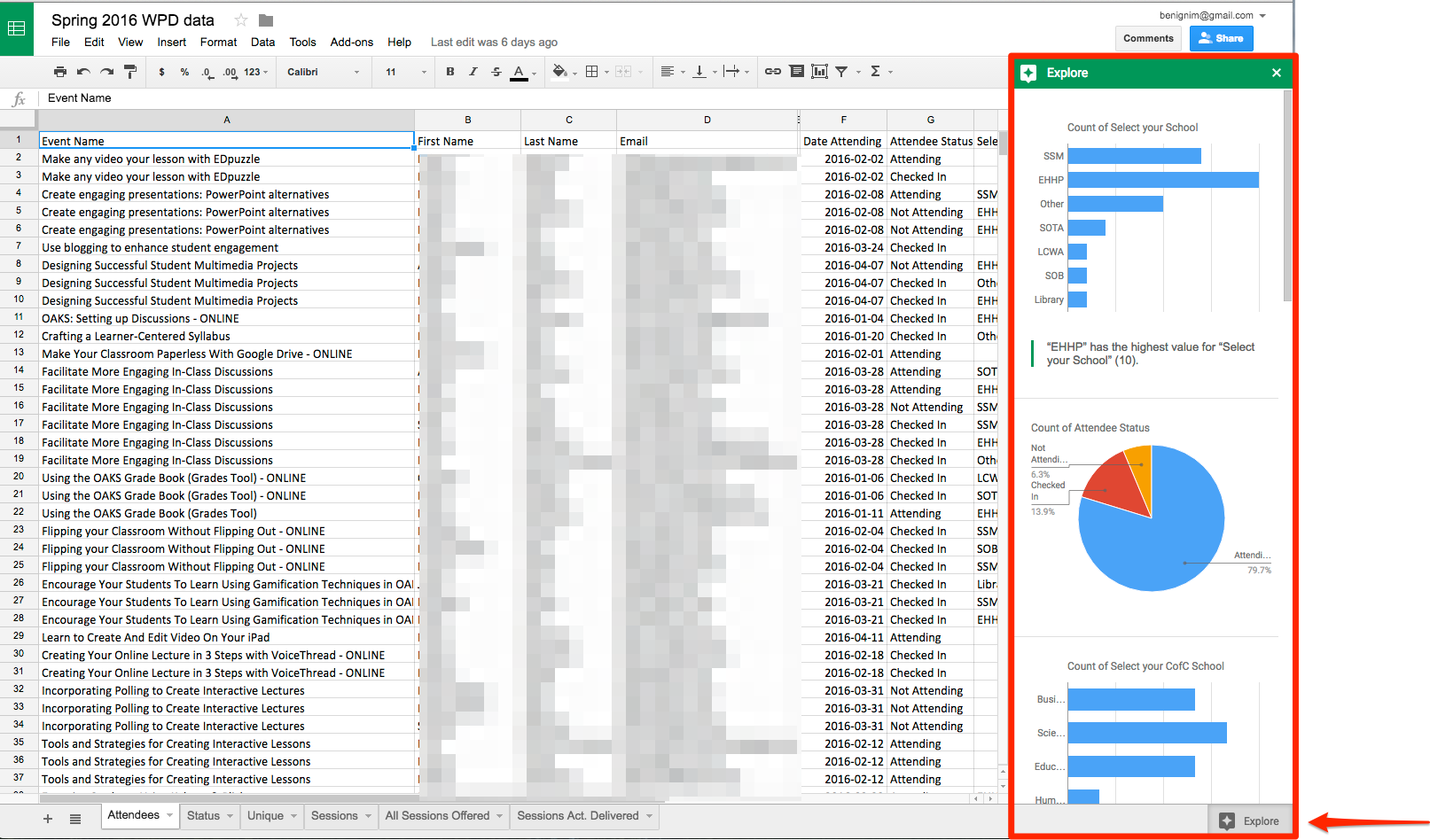
Sheets has a super cool EXPLORE icon in the lower right corner of every spreadsheet. This offers a quick overview of the data in chart format. You can view the entire sheet or just specific rows or columns. It’s a fast way to get a first look at the trends in your data before moving on to your own analysis. Just click on the icon and Google does the rest. Don’t worry, if this doesn’t provide enough analysis you can always create your own graphs, pivot tables, and calculations.  Excel doesn’t have this feature that I can find.


These are just my top 6 reasons to use Google Sheets. I have a ton more. So, can I do everything I did in Excel in Google Sheets? No, I can’t. Excel’s statistical analysis features and functions are still more powerful and probably always will be, but that’s not really what I use spreadsheets for much anymore. Most of the features I used in Excel, like shifting cells, can be done via a Google Add-on, which is a little extension that you can load to increase Sheet’s functionality. Given that, there’s very little need for me to go back to Excel.

Still not sold?

Check out Alicekeeler.com. Alice Keeler is a Google Sheets guru and she always has some amazing cool tricks that you can do with spreadsheets in the classroom. She has written some Add-ons for Sheets that allows you do have more control and automate some processes. Teacher Education folks, you will love her as all of her examples are from her classroom experience.  Check out this one:

Have everyone contribute to their own tab – Give students their own and collaborate. This add-on takes your class roster and automatically creates a spreadsheet tab customized for each student in your class. It can even copy a template to each tab. What a great timesaver!

Google Sheets my fav. 5 tips and tricks
Google, Google Apps, Productivity, Research, TLT

Give Sheets A Chance

I am a huge fan of Microsoft Excel.  It’s my second favorite application, after Photoshop.  However, I’ve been attempting to move all of my work to Google Apps for Education and I felt like Google Sheets was just not as robust a program as Excel.  That being said, I’ve been working with Sheets exclusively for several months now and am finding many things that are making me love it.  Not as much as Excel, but close.

Here are my top 5 coolest things I’ve learned over the past months:

EXPLORE

screenshot of the explore area openNext time you open up a spreadsheet in Google Sheets, notice the little icon in the lower right cornerExplore icon.  If you click it you get a flyout panel called Explore.  This panel gives you a fantastic overview of your data in chart form and allows you to easily add the charts to your document with one simple click.  I loved this and I don’t believe there is an equivalent in Excel.

How can you use this?

If you create a form, in Google Forms, your data will be collected in a Google Sheet.  The charts in Explore give you the overview you need to get started on your data analysis

You can upload any Excel spreadsheet into Google Sheets and it will convert it to Sheets format so you can get this overview on data NOT collected in Google Drive.

PIVOT TABLES

A pivot table is a tool that allows you to summarize and explore data interactively and is particularly useful for large data sets.   I use them primarily to count or average things but they can be used to extract all types of date from sets.   Google Sheets now allows you to easily create these pivot tables.  Here’s an example of a quick table created from the data we looked at above.  This is a simple pivot table but they can be more complicated depending upon your needs.  Just like in Excel, they update in real time, as the data in the Sheet changes.  You can find pivot tables under Data > Pivot Table

screenshot of the pivot tableScreenshot of a more complicated pivot table

ADD AND DELETE CELLS INSTEAD OF ONLY ROWS OR COLUMNS

There are many times that I want to delete or add a few cells in a spreadsheet and have the rest of the spreadsheet shift to accommodate those cells.  In Sheets you can only add or delete and entire row or column which isn’t very helpful.  With the help of an Add-On called Insert and Delete Cells by Karl.kranich.org you now can.  In Sheets go to Add-ons in the menu bar then choose Get add-ons  In the search area, type in Insert and Delete Cells.  Click on Free.  A pop up window will appear so make sure pop-ups are not blocked.  From that window click Allow. 

Screenshot of the menu To add or delete cell(s) just click on the appropriate cell(s) and choose Add-on again.  You will see it in the menu a new option to allow you to shift the cell after adding or deleting. 

How can you use this?

I use this feature all the time.  Here’s an example:  I paste or import data into a spreadsheet and for some reason, one line is offset just one cell.  This happens if there is a wayward space in the paste.  Now I can just select that cell and shift the rest of the columns one cell to the left to line all the data back up.

FINDING UNIQUE AND DUPLICATES

As much as I love Excel I still struggle with filtering duplicates from a dataset.  This is also something that I use all the time.  For instance, for our training stats, I like to see all the individuals that attended TLT training in one year.  For this report, I only want each individual counted once.  For this I use an add-on called Remove Duplicates by ablebits.com.  Just like earlier you can get it from the Add-ons > Get add-ons menu and search for Remove Duplicates.  Once it’s installed you just select the data then choose Remove Duplicates from the Add-ons menu and follow the instructions.  It’s just four easy steps to locating all the unique or duplicate entries in your data and I think it’s 10x easier than the filter feature in Excel.

PREVENT PRINTING, COPYING, AND DOWNLOADING

Screenshot of Advanced SharingDid you know that you can share a spreadsheet with people without giving them the ability to print it, copy it, or download it?  Well you can.  Just open your Sheet and click on the Share button in the upper right corner.  Now click on Advance in the bottom right of the new window.  Make sure your normal settings are set correctly depending upon the level of security you want.  Then at the bottom click on Disable options to download, print, and copy for commenters and viewers.  This actually works surprisingly well, especially with a large spreadsheet.  Could some take a screenshot of the data?  Sure, but the only way to stop that is to not let them see it in the first place.  

How can you use this?

This came to my attention when a faculty member wanted to share a large list of internship options but didn’t want that list to be shared with those outside her class.  Again, while not foolproof, it provides enough of a deterrent to meet the needs.

REMEMBER:  DO NOT STORE ANY STUDENT SENSITIVE INFORMATION ON GOOGLE DRIVE/SHEETS.

I hope these tips will get you to reconsider Google Sheets as a viable alternative to Excel.